Crafting letters is an art form. If ill-crafted, you risk your letter going into the trash without being read. You risk this even with a well crafted letter.
KEEP IT RELEVANT: Writing an email is like writing an advertisement. When we realize this, we might approach the entire endeavor a little differently and hopefully will see more clicks and eyes reading than the vacant stares of…hmm? You sent what? I never got that!
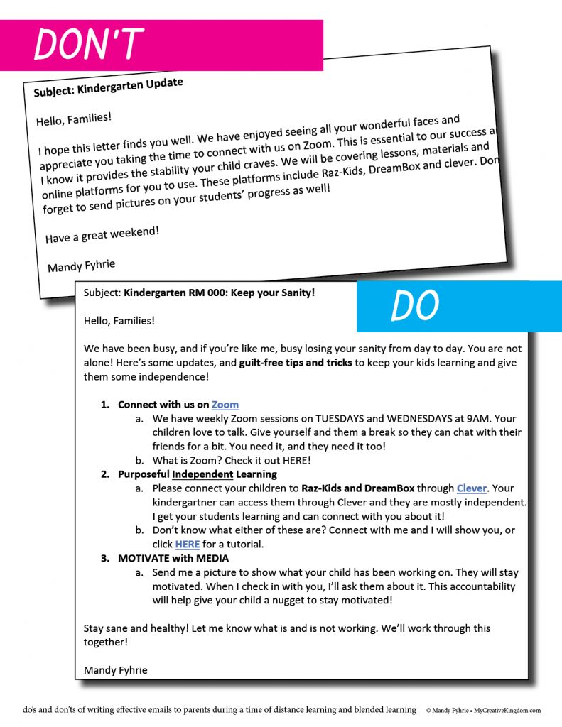
Start with the Subject Line. Create a subject line that is both informative and yet intriguing. Know your audience and what will capture their attention. We live in an age of texting, skimming and limited contact. Even grandparents are accessing email on their phones. Keep your subject line short. It won’t display the entire title past a certain number of characters (text) on an iphone, ipad or computer. Which email would you read? Ex: Kindergarten Update or Ex: Kindergarten RM XXX: To Read Online or Not?
What NOT to include: acronyms, big words, your political view. Teachers have their own vocabulary that should stay with them and not be imposed on poor parents. They don’t know what you mean by MTSS and all the new lingo. If you use an acronym, explain what it is in simple, straight forward terms. The last one should go without saying, but explaining your personal view of a situation rather than presenting the facts and reality doesn’t help anyone. Use facts and talk in what ifs. Don’t expect business as usual. Present alternatives to families by using the facts. If you aren’t sure, just say you aren’t sure and lean on your administration for guidance.
What you MUST include: Keep your email SHORT. SHORT, SHORT, SHORT. Did I say short? Oh, yeah, SHORT! No one has the time or mental energy to read lots and lots of words on a page, so keep it ______. You know. ALSO, we know that people are not likely to read your entire email, so help them skim what you want them to skim by bolding the key points or first line of each bulleted item. This isn’t an essay, it’s communication. So use italics and bold. But, use it sparingly. Too much of a good thing means it will go in the trash. Don’t type in all caps unless you mean it…I mean, SHORT 🙂
OK, Not TOO short: We don’t want to email something with two lines and then have to send lots of emails later. More emails means it goes in the trash and you didn’t effectively communicate your message. You know what is too short — go for an arms length. Utilize bullet points and include links for more information when necessary. This is a way of including more information for those who want it, and leaving it out of the body of the email for those who don’t.
USE simple fonts: those fun curly cue fonts are not meant for email. Nor is that lime green or yellow font. I can’t read it and it’s hard on the eyes. Do use color, but sparingly the way you would bold and italicized fonts. Stick with Times New Roman or Cambria 12-point font, single-spacing (not double spacing for emails), and two returns for a single space between paragraphs.
ASK for family communication: If it’s an important email, track who opens your email or not. You can also ask families who uses emails and who doesn’t. You need to know who wants to communicate with you in what way. This will prevent valuable information from going in the trash.
Try to be consistent: try to include a similar format and send emails (if you can) on the same day each week. This will let your families know you are contacting them regularly, but not feel frustrated by too much. Many people are using email who haven’t in the past. It can be overwhelming for families and teachers alike.
USE GRAPHICS: A well-placed graphic can cause intrigue. However, too large of a picture (physical size or takes too long to load because of the file size) will dilute any chance you had at captivating your audience. So keep it simple, appropriate and smallish. Remember, people access your email from different platforms – phone, computer, tablet.
You can see an example of a do and don’t letter with and without these tips below to see how it can change the way you write. I didn’t include a picture in either, and notice how the second email is short, but not as short as the first. This is intentional. Without reading either, looking at both, hopefully, your eyes will be drawn to the second email and you will effectively skim the material your reader wants to see.

